Plotting and exploring geospatial data in R is a bit of a mixed bag. It’s not my platform of choice for exploring geographic data (a desktop GIS like QGIS is usually better for this task), but it’s possible to generate high quality scientific figures in R from geospatial datasets (including raster data). Generating figures in R has numerous benefits, the largest of which is probably reproducibility: if something changes about your data or analysis, it’s easy to recreate the figure.
The ecosystem of packages and tools for making data visualizations is really large, and it can be tough to figure out how to get started. This article reviews a few different ways to plot raster and vector data in R.
Workspace setup
First we need to install and load some packages. In addition to the packages required by rSDP, we will need to install a few others as well.
Finding SDP data
First, we will use the functions in the rSDP package to locate and download some raster data. For more information on finding and connecting to datasets, check out the tutorial “Accessing Cloud-based Datasets”.
snow_cat <- sdp_get_catalog(domains="UG",types="Snow",releases="Release4")
snow_cat[,c(1,4)]
#>     CatalogID
#> 75     R4D001
#> 76     R4D002
#> 77     R4D003
#> 125    R4D051
#> 126    R4D052
#> 127    R4D053
#> 128    R4D054
#> 129    R4D055
#> 130    R4D056
#> 131    R4D057
#> 132    R4D058
#> 133    R4D059
#> 134    R4D060
#> 135    R4D061
#> 136    R4D062
#> 137    R4D063
#> 138    R4D064
#>                                                                              Product
#> 75                                Snowpack Persistence Day of Year Yearly Timeseries
#> 76                                      Snowpack Onset Day of Year Yearly Timeseries
#> 77                                               Snowpack Duration Yearly Timeseries
#> 125              Snowpack Proportional Reduction in Freezing Degree Days (2002-2021)
#> 126 Snowpack Proportional Reduction in Early Season Freezing Degree Days (2002-2021)
#> 127  Snowpack Proportional Reduction in Late Season Freezing Degree Days (2002-2021)
#> 128               Snowpack Proportional Reduction in Growing Degree Days (2002-2021)
#> 129  Snowpack Proportional Reduction in Early Season Growing Degree Days (2002-2021)
#> 130   Snowpack Proportional Reduction in Late Season Growing Degree Days (2002-2021)
#> 131                                  Snowpack Duration Mean (Water Year 1993 - 2022)
#> 132                    Snowpack Duration Standard Deviation (Water Year 1993 - 2022)
#> 133                                    Snowpack Onset Day of Year Mean (1993 - 2022)
#> 134                        Snowpack Onset Day of Year Standard Deviation (1993-2022)
#> 135                              Snowpack Persistence Day of Year Mean (1993 - 2022)
#> 136                  Snowpack Persistence Day of Year Standard Deviation (1993-2022)
#> 137                               Snowpack Persistence Uncertainty Yearly Timeseries
#> 138                                     Snowpack Onset Uncertainty Yearly Timeseries
Reading in data
snow_rast <- sdp_get_raster("R4D001",years=2018:2021,
                            download_files = TRUE, download_path = "~/Downloads")
#> [1] "Returning yearly dataset with 4 layers..."
#> [1] "All files exist locally. Specify `overwrite=TRUE` to overwrite existing files."
#> [1] "Loading raster from local paths."
roads <- st_read("https://rmbl-sdp.s3.us-east-2.amazonaws.com/data_products/supplemental/UG_roads_trails_osm.geojson")
#> Reading layer `UG_roads_trails_osm' from data source
#>   `https://rmbl-sdp.s3.us-east-2.amazonaws.com/data_products/supplemental/UG_roads_trails_osm.geojson'
#>   using driver `GeoJSON'
#> Simple feature collection with 6814 features and 10 fields
#> Geometry type: MULTILINESTRING
#> Dimension:     XY
#> Bounding box:  xmin: -107.2097 ymin: 38.45493 xmax: -106.3205 ymax: 39.06456
#> Geodetic CRS:  WGS 84
Formatting data
Once we’ve got data loaded, we need to do a few things to clean it up and get it in the right format for plotting:
Basic raster maps with terra::plot()
The fastest way to plot a raster dataset in R is with the built-in
plot method for SpatRaster datasets in the
terra package. This can be as simple as:
plot(snow_rast)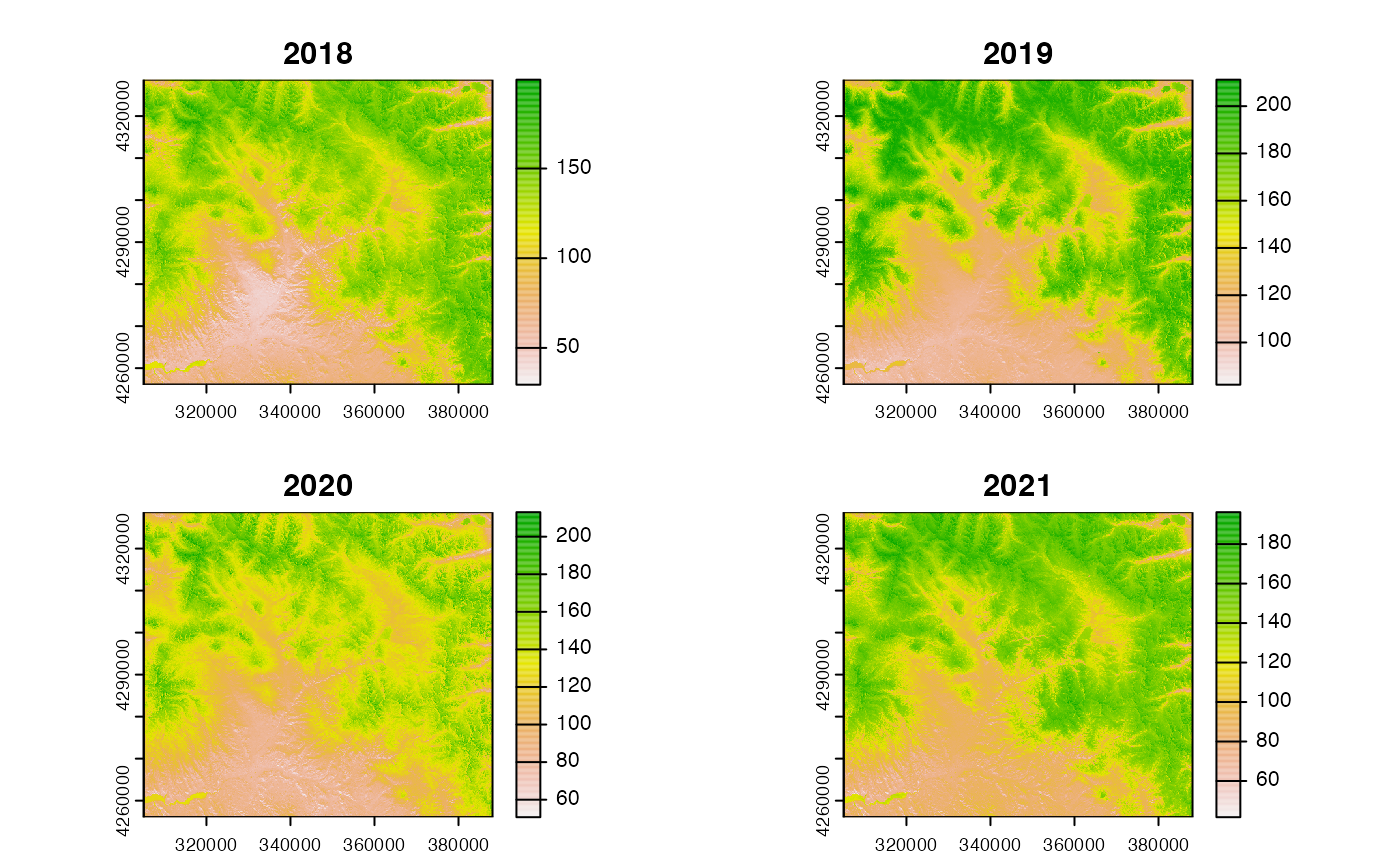
This generates plots of all of the layers in the raster dataset. In
this case, the plots represent snowpack persistence for four years, 2018
to 2021. You will notice that the color ramp visualizing the data is
different for each layer. This might not be ideal if the layers all
share the same numeric scale. We can standardize the scales of the color
ramp across layers by specifying the range argument:
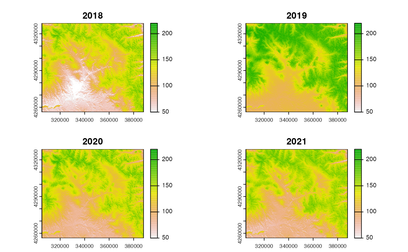
The default color ramp is only one possibility for visualization. The
color scales in the viridis package are particularly
useful, because they are color-blind friendly and have other nice
properties.
library(viridis)
#> Warning: package 'viridisLite' was built under R version 4.1.2
plot(snow_rast,range=c(30,220),col=viridis::cividis(n=255))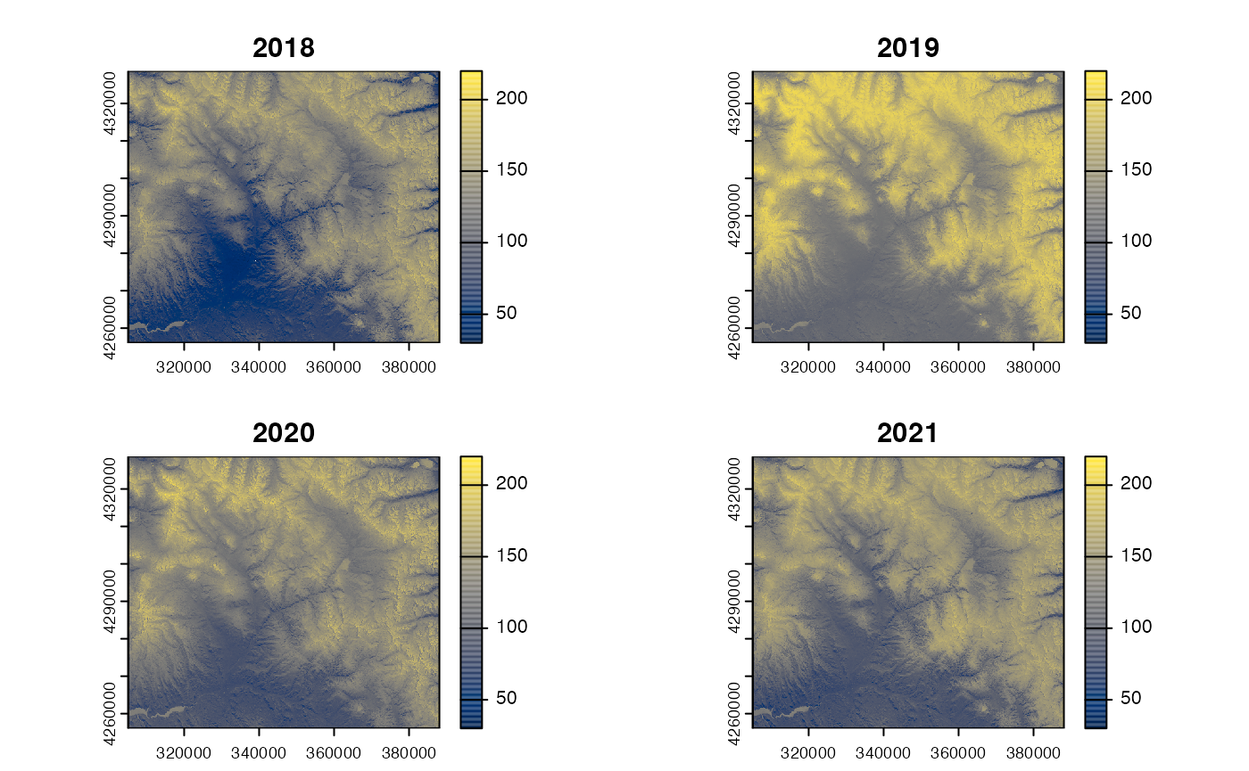
You can define your own custom color ramp with a call to
colorRampPallette(). This creates a color generator
function which you can use to create arbitrary number of colors along a
gradient. In the example below, we define the jet_colors()
function and then pass it along as the col argument in
plot, this creates a color scale with 255 values.
jet_colors <-
  colorRampPalette(c("#00007F", "blue", "#007FFF", "cyan",
                     "#7FFF7F", "yellow", "#FF7F00", "red", "#7F0000"))

plot(snow_rast[[1]],range=c(25,220),
     col=rev(jet_colors(255)),
     main="Snow Persistence (Day of Year)")
plot(roads_proj,add=TRUE,col="grey20")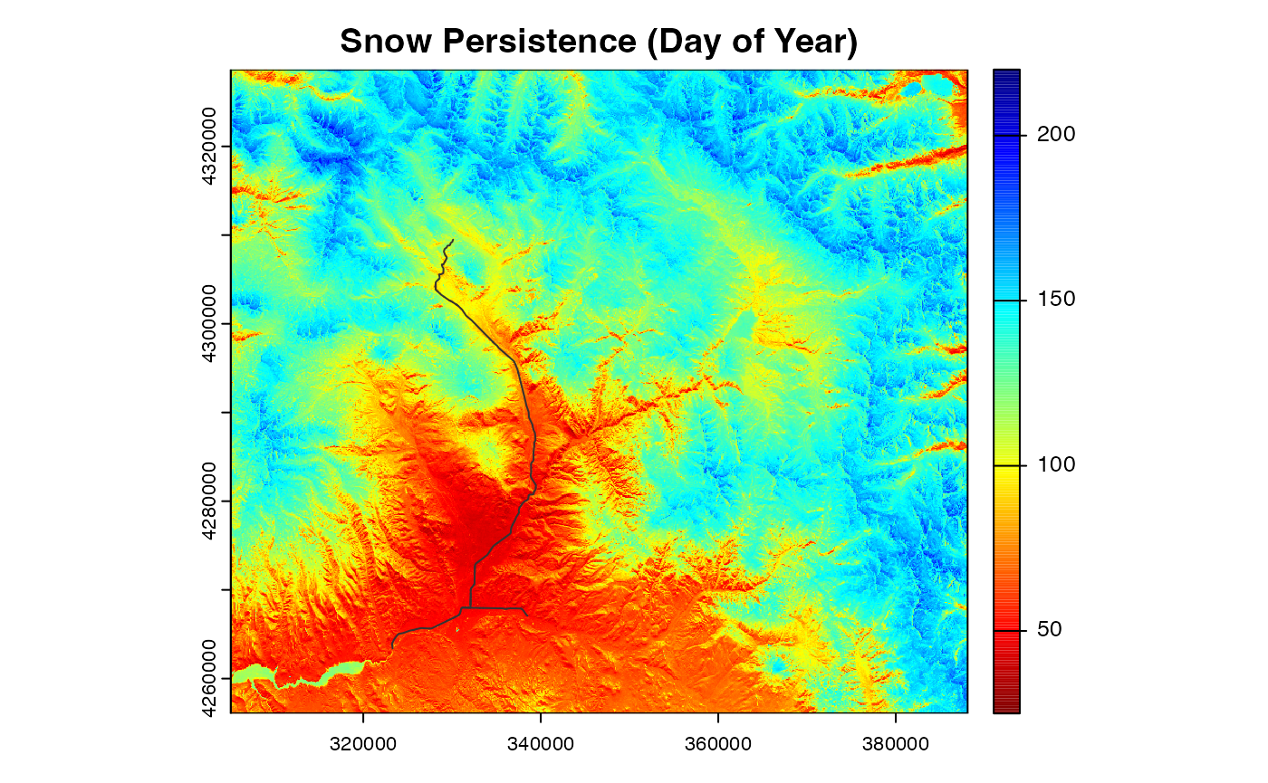
In specifying the color ramp, we are using a mixture of named colors
(e.g. "yellow"), along with 6-digit alphanumeric codes
starting with a #. The codes are “hex colors”, which is a
widely used color coding system. To look up the hex code for any color
and generate custom color ramps with hex codes, check out the scale web resource.
Here’s a color-blind friendly custom color ramp:
earth_colors <-
  colorRampPalette(c("#001344", "#002E68", "#095186",
                     "#19769F","#2F9AB1", "#47C7B8",
                     "#63D9A9", "#82E7A1","#A5F3A5",
                     "#D8FACC", "#FAFFF5"))

plot(snow_rast[[1]],range=c(25,220),
     col=earth_colors(255),
     main="Snow Persistence (Day of Year)")
plot(roads_proj,add=TRUE,col="grey20")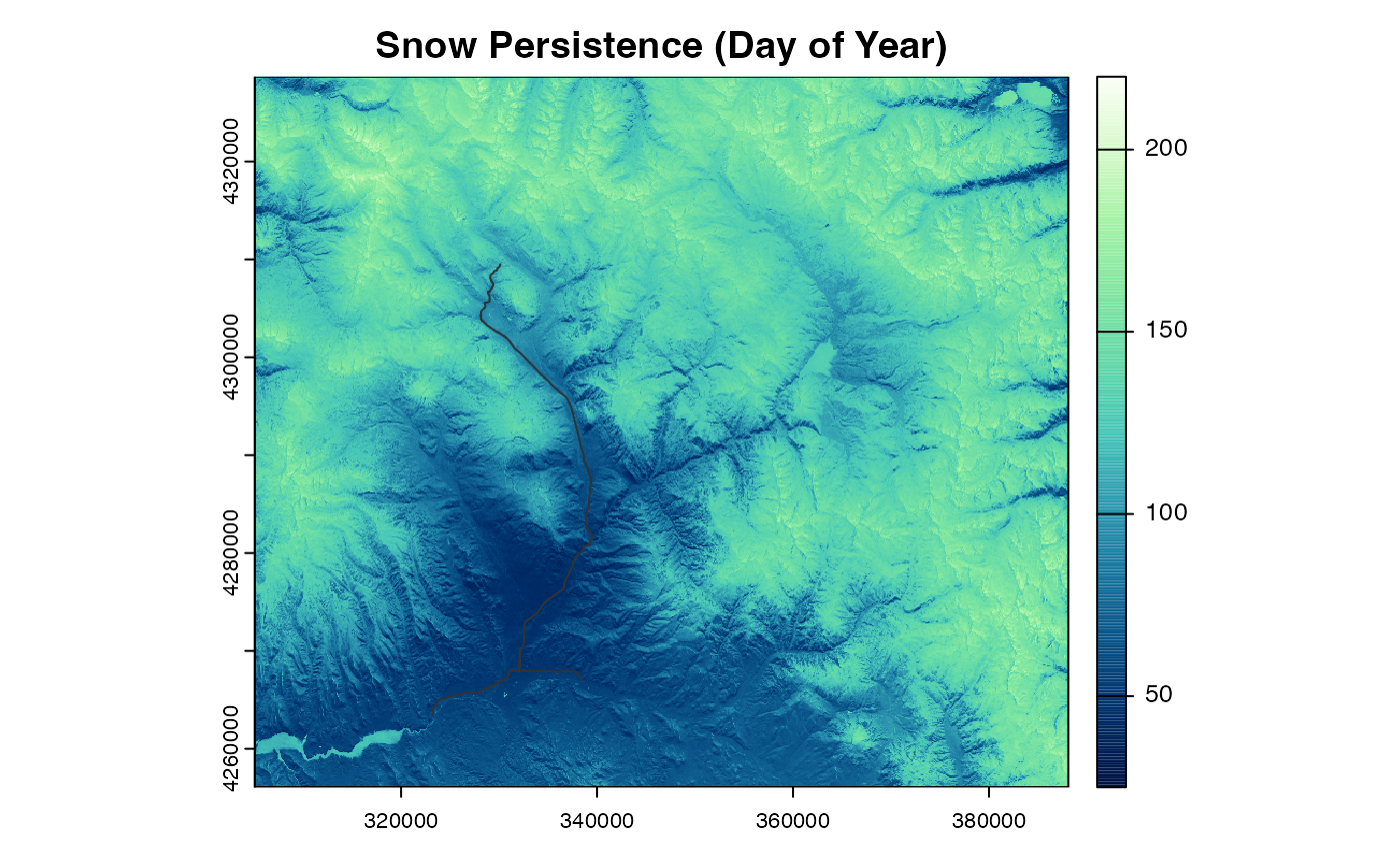
Web maps with leaflet
It’s sometimes useful to plot raster datasets on a web map that
enables interactive exploration and overlays data on an informative
basemap. The terra::plet() function achieves this:
Prettier maps with tidyterra and ggplot2
The base functions in terra for plotting maps are
flexible and fast, but it can often take quite a bit of coding and
customization to achieve a publication-quality result. An alternative
option is to use functions in the tidyterra package to
integrate raster and vector datasets into the widely used
ggplot2 plotting system. Integrating scale bar and north
arrow functions from the ggspatial package can achieve
publication-quality visualizations without a large amount of
customization:
## Simple one-panel map with scalebar and north arrow.
map0 <- ggplot()+
  geom_spatraster(data=snow_rast[[1]])+
  geom_spatvector(aes(color="highway"),data=roads_proj)+
  scale_color_manual("",values=c("grey40"))+
  scale_fill_whitebox_c("Day of Year",limits=c(20,220),
                        palette="muted",direction=1)+
  scale_x_continuous(expand=c(0,0))+
  scale_y_continuous(expand=c(0,0))+
  annotation_scale(location="br", height=unit(0.2,"cm"))+
  annotation_north_arrow(location="bl", height=unit(1,"cm"),
                         width=unit(1,"cm"))+
  theme_minimal()
#> SpatRaster resampled to ncells = 501134
Just like with other plot types that use ggplot, you can
change the extent of the plot by specifying scale limits:
## Zooming in.
map0 + scale_x_continuous(limits=c(327306, 342195),expand=c(0,0))+
       scale_y_continuous(limits=c(4289070, 4307572),expand=c(0,0))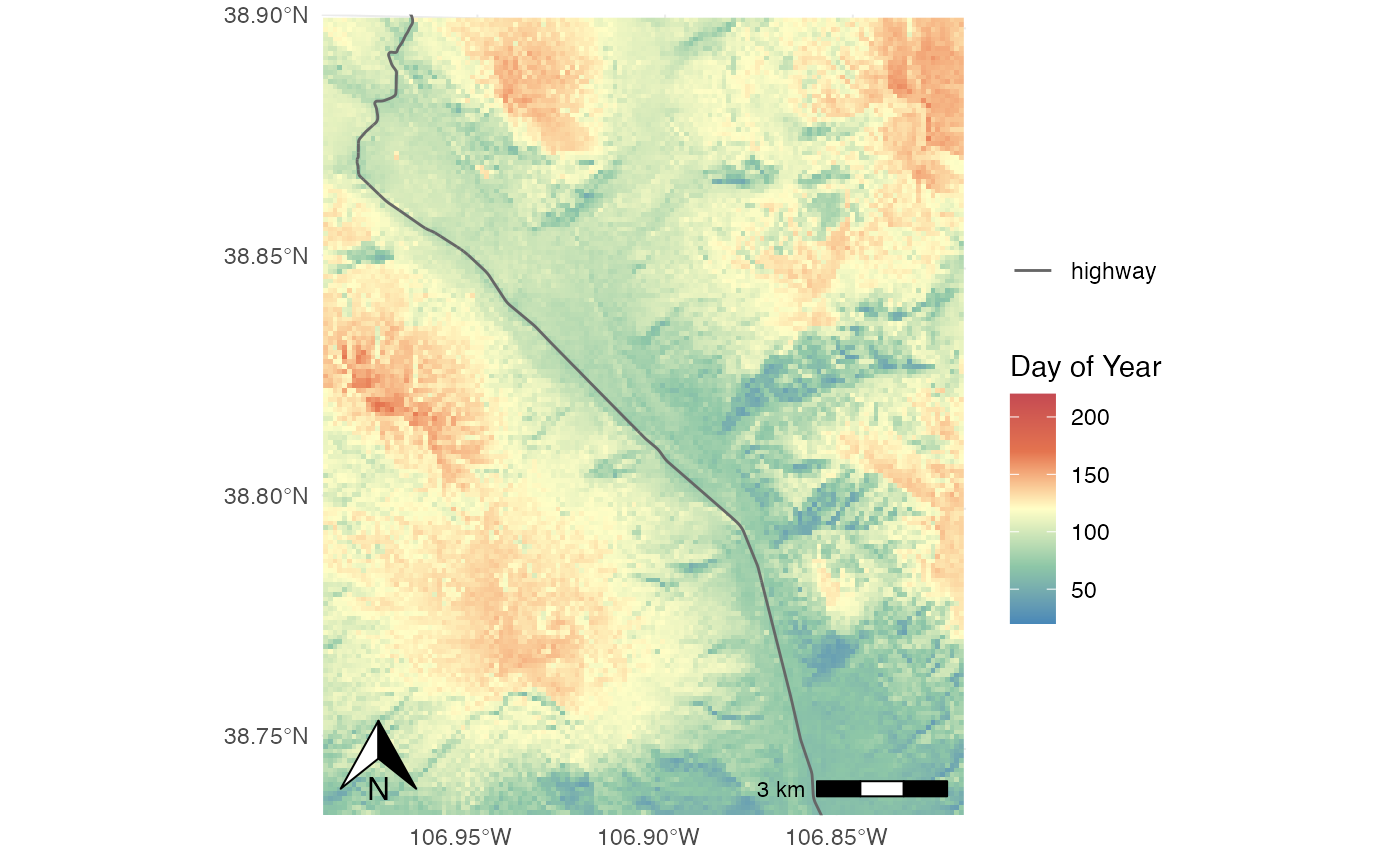
Faceting for multi-panel maps
One of the most powerful features of ggplot() is the
ability to display multiple subsets of data as small multiples,
repeated plots with common scales and other visual elements. These are
called facets in the ggplot syntax. In the example
below, adding facet_wrap(facets=~lyr) to a basic plot
produces a multi-panel plot with each layer in the
SpatRaster plotted as a separate panel with a common color
scale:
Simple faceted map
map1 <- ggplot()+
  geom_spatraster(data=snow_rast[[1:3]])+
  facet_wrap(facets=~lyr)+
  theme_minimal()
#> SpatRaster resampled to ncells = 501134
map1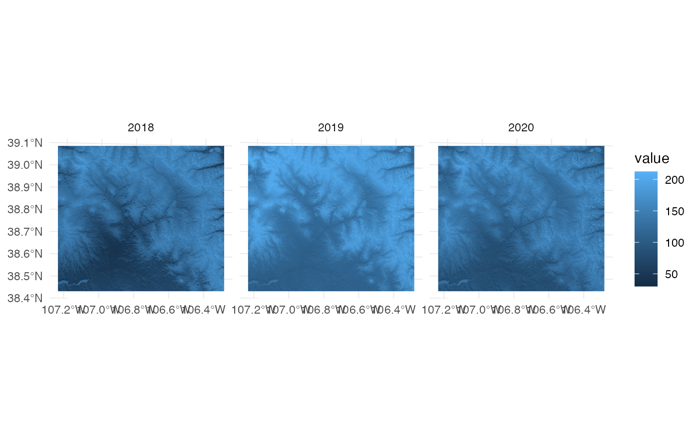
Color ramps with tidyterra and
viridis
The tidyterra package comes with a few useful color
ramps, including the Wikimedia
scales for topographic data (see the scale_fill_wiki_*
and scale_color_wiki_* functions), as well as the more
general Whitebox
color ramps. You can also use all of the great scales in the
viridis package:
map1 <- ggplot()+
  geom_spatraster(data=snow_rast[[1:3]])+
  facet_wrap(facets=~lyr)+
  scale_fill_viridis("Snow \nPersistence \n(DOY)",option="mako")+
  theme_minimal()
#> SpatRaster resampled to ncells = 501134
map1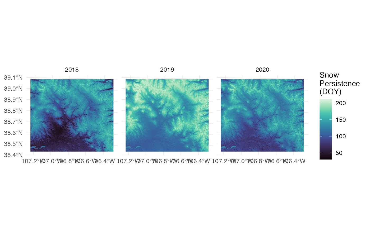
Full faceted map with scalebar
With a bit of extra wrangling, you can get a publication quality
multi-panel map with,ggplot2, tidyterra, and
ggspatial. In the code below, we create two tables of
parameters which specify the details of the scale bar and north arrow
and in which panels where they appear.
# Study area boundary (simplified for fast display).
UG_bound <- sf::st_read("https://rmbl-sdp.s3.us-east-2.amazonaws.com/data_products/supplemental/UG_region_vect_1m.geojson")
#> Reading layer `UG_region_vect_1m' from data source
#>   `https://rmbl-sdp.s3.us-east-2.amazonaws.com/data_products/supplemental/UG_region_vect_1m.geojson'
#>   using driver `GeoJSON'
#> Simple feature collection with 1 feature and 2 fields
#> Geometry type: POLYGON
#> Dimension:     XY
#> Bounding box:  xmin: 307895 ymin: 4258017 xmax: 385679 ymax: 4326087
#> Projected CRS: WGS 84 / UTM zone 13N
UG_simple <- sf::st_simplify(UG_bound,dTolerance=100)

# North Arrow and Scale Bar properties.
arrow_params <- tibble::tibble(
  lyr = "2020",
  location = "br")

scale_params <- tibble::tibble(
  lyr = "2018",
  location= "br",
  width_hint=0.3,
  line_col="white",
  text_col="white")

# Full Map
map2 <- ggplot()+
  geom_spatraster(data=snow_rast[[1:3]],maxcell=5e+05)+
  geom_spatvector(aes(color="Study Area"),data=UG_simple,
                  fill=rgb(0,0,0,0),lwd=0.5)+
  labs(title="Spring Snow Persistence",tag="(a)")+
  scale_fill_viridis("Day of Year",option="mako",limits=c(20,220))+
  scale_color_manual("",values=c("grey90"))+
  scale_x_continuous(expand=c(0,0),breaks=c(-107,-106.4))+
  scale_y_continuous(expand=c(0,0),breaks=c(38.5,38.7,38.9))+
  annotation_north_arrow(aes(location=location),
                         style=north_arrow_minimal(fill="white",
                                                   line_col="white",
                                                   text_col="white"),
                         which_north="true",
                         height=unit(0.35,"in"),
                         data=arrow_params)+
  annotation_scale(aes(location=location,
                   width_hint=width_hint,
                   line_col=line_col,
                   text_col=text_col),
                   style="ticks",
                   data=scale_params)+
  facet_wrap(~lyr,ncol=4)+
  theme_minimal()+
  theme(axis.text.x=element_text(size=10),
        axis.text.y=element_text(size=10),
        legend.position="bottom")
print(map2)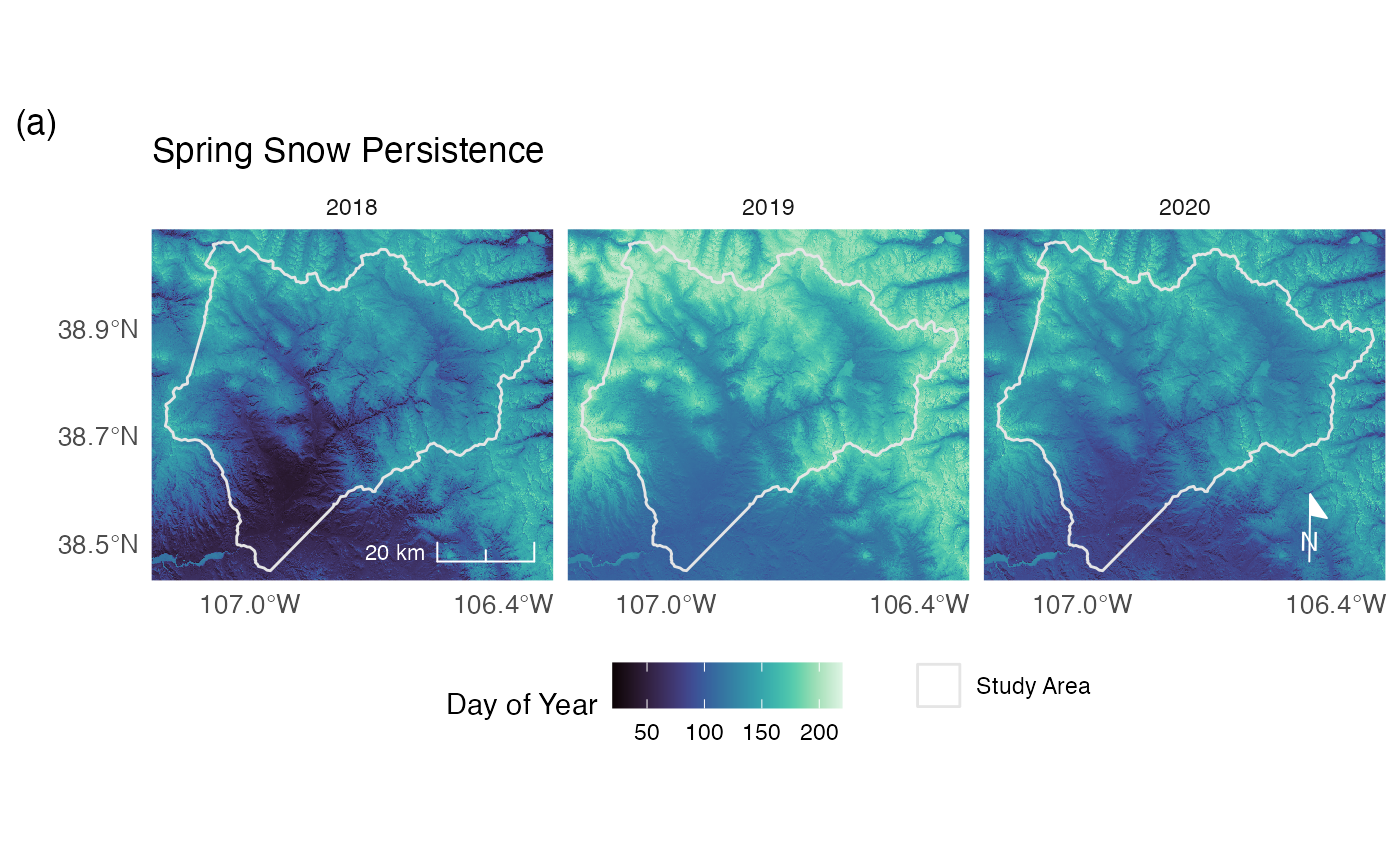
Exporting maps
To export figures from R so we can add them to documents or further
edit them in a drawing program, we need to export them to an external
file. The two best formats for this are PNG, which is an efficient
raster graphics format, and PDF, which is a largely vector format, but
can also include embedded images. To get sharp PNG output, we usually
want to specify a resolution of at least 300 points per inch using the
res argument.
PNG Export
png("~/Downloads/snow_3panel_tidyterra.png",
    width=8,height=4,units="in",res=300)
map2
dev.off()
#> agg_png
#>       2
The vector portions of a PDF plot will always look sharp in the
resulting file, and the resolution of the raster visualization is set by
the maxcell argument to geom_spatraster when
we created the map above.